Project Background
Each feature was being designed separately on different devices. This resulted into a inconsistent user experience for our customers on Web and Mobile.
As Experience design lead and Design Evangelist, along with a team I designed and shaped the product experience for over 1.5M users across iOS, Android & web.
Goals:
My vision was to create consistency across all touch points within Replicon ecosystem.
Overview:
Document and enhance patterns and components across Replicons products. The Interactive pattern library is a living guide for designers and developers to drive a consistent look and feel and integrating the user experience on multiple devices to keep the journey easy within the Replicon ecosystem.
Replicon's UI color palette is derived from Replicon's brand palette, consisting of Replicon blue and orange as accent colors that compliment the brand.
Replicon blue is used for the foundation of the UI. Blue is used for key UI elements like navigation, buttons, links, and text. Green, yellow, red for approval status and a variation of those colors for time tracking buttons and success messages after actions are complete. Orange is used for hovers, insights, alerts, and communication with the user.
Replicon Color Palette
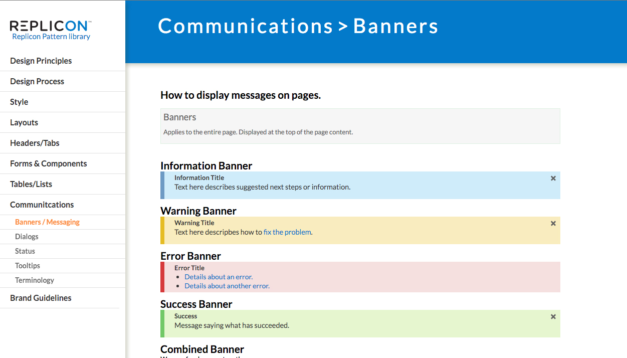
Web Communication banners
Tables & Lists (Original design)
Tables & Lists (New enhancements)
Invoice worksheets bring Invoices to life with smart editing and styling tools to help you easily editing "billing rates" and "Units" to easy Invoice. (New enhancements)
Audit History UI Pattern
- I visually treated the history as a timeline view which helped structure the content within two sections; Time data and the corrections made to time data.
- The Icons in the center help identify which device the time was captured from.
- The hierarchy of time data is from start to end of the day for easy scanability
- Each change made to time punches is captured with a time stamp and logged within the Replicon system for auditing purposes.
- Changes made to the "original" time data displays as "Edited" or "Deleted" if removed
- When employee forgets to clock In you can add missing time data displayed as "Added"


